Before I sit down to write this, I make myself a cup of tea. I remove a tea bag from a small wooden box with a design on the side that looks like it may be an illustration from a Dickens novel, on another side, there is a large shamrock: Irish Breakfast tea. The mug that I use is handmade and painted in Poland. The spoon I use to stir the milk into the tea is made of cherry wood, a deep rich colour with little leaves carved onto the handle. Do these elements make the tea that I will drink better? Probably not, but the process of making the tea has been made a little more beautiful due to the intricate designs on the tea box, the mug, and the spoon. In William Morris’ News from Nowhere, we are introduced to a world in which every detail, down to the spoon that one stirs their tea with to the labour that characters perform, is beautiful and brings happiness, a Utopia. While I don’t exactly see Nowhere as a Utopia, as this imagined world lacks elements that I believe to be beautiful, such as art and museums, it made me realize the importance that everyday objects hold in our daily lives. While strictly material, the mug that I drink my tea from, the wood spoon, and the tea box that I leave out on my counter are things that I enjoy and appreciate when I see them and when I use them. I recently read Holly Connolly’s “Is social media influencing book cover design?” an article published by The Guardian. To put it very simply, my response to that question would be: yes … but it is not the first time that books have been seen as accessories, beautiful accessories, and it is certainly not the first time that book covers have held an aesthetic value.
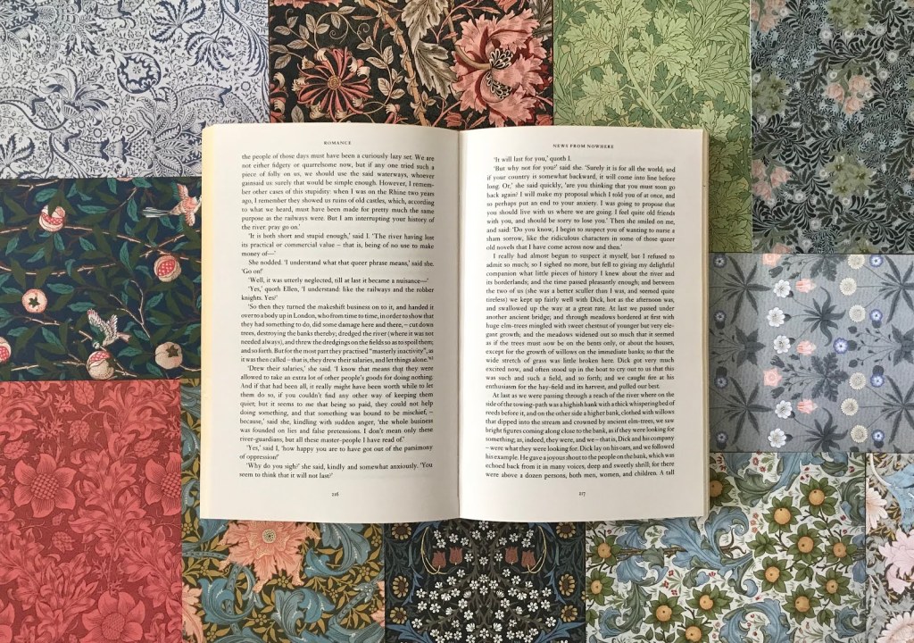
In the Middle Ages, small books that could fit into one’s hand were given as gifts, were prized possessions, and popular among those who were wealthy, these illuminated manuscripts were known as a Book of Hours. These books were carefully created for the reader, they were personalized, detailed, at times worn as an accessory, and used for one’s devotional practices. The designs were intricate, each page was painted and printed, making no book identical to the next. I remember studying and learning about these books in my Art History class and thinking about William Morris. In a course on Victorian Literature, when reading News from Nowhere, my professor introduced us to other artistic works made by the author. The carpets, tapestries, and wallpaper, each inspired by the natural world, designed with delicacy and precision. The printing of Morris’ written works, framed by the author’s elaborate designs added to and increased their aesthetic value. And so, from the Middle Ages to Victorian England, we see the book as, once again, an aesthetic object.
I have never agreed with the statement: “Don’t judge a book by its cover,” aside from the summary on the jacket, the cover itself is a visual summary, an indication of what is held between its covers. An importance should be placed on book cover design before it reaches the shelves, our first encounter with a book is always visual. We may hear about it first, but when we research it, or find it in a bookshop, the first thing we do is see it. The difference between our current engagement with books and that of the Middle Ages or Victorian England, is that we have social media. Multiple platforms whose essential element is pictures, the visual. More than ever, we are introduced to books through photographs, oftentimes, of their covers. As Connolly stated, book covers from a number of years ago look busy … they also do not “go” with most backgrounds, perhaps they are more difficult to photograph. But the current designs are easy on our eyes, they have softer tones, clean covers, less distraction (of course, there are always exceptions to this!), they are also simple to photograph, no need to worry about a busy background, or the elements we choose to put next to them in the photo, the cover won’t take away from it, it will be neutral, it will blend in or stand out with its minimalist design.
While I don’t personally see older book covers as being busy or loud, I think there was a reason for this. Books were aesthetic objects that were to be shown on bookshelves, they were made to be as visually impressive as they were intellectually, they were made to have value through their embellishments. The use of leather, gold, and intricate design, were all responsible for making the book look rich and beautiful to the eye. But this is not what is “in fashion” at the moment. Many still appreciate a beautiful book, and even more so, a beautiful collection. The series has evolved, it still has colour and patterns, but there is a sense of uniformity to them, they are so photogenic together! I’m thinking about Penguin’s Clothbound Classics, each cover has different ingredients, but the recipe is the same, and so together, they move amongst one another so well on the shelf. There is no doubt that social media affects book cover design, but ultimately, it is a social platform on which one individual shows others their books, not unlike the libraries of Victorian England, or the Book of Hours worn as an accessory, they are all to be seen by others, not necessarily as their sole purpose, but a purpose which is important. It is perhaps important to the individual, but now more than ever, it is important to the publisher. The book cover and the appearance of the book on social media is a part of the marketing and advertising of the published work.
When reading Connolly’s article, I felt that there was a sense of embarrassment, of shame for a bookstagrammer who purchased an edition of a book because it is more beautiful and would look nice on Instagram, this is nothing to be ashamed of, as it is nothing new. Yes, the value of a book is found within its pages, but these written works continue to be aesthetic objects, as they have been for hundreds of years. One should find a great pleasure in reading a book, but once they’ve finished it, they should also find an equal pleasure in looking at it on their shelf and in their library. There is much to be said, as Morris once noted, for beauty in the everyday objects of our lives, those small elements making our day-to-day and our surroundings just a little more aesthetically pleasing.
Photo: William Morris’ News from Nowhere amongst postcards of Morris’ work from the Victoria & Albert Museum postcard collection

Leave a comment